Hopefully Fun Draft Book Covers
 I’ve been making my own EPUB versions of various working novels (using the Calibre program, which has gotten good reviews and which I recommend highly) to see how a novel comes across in that format, and to do yet another proofing for typos and errors. It’s amazing what errors jump out at you once your published book comes out in e-format, and to minimize this trauma you can make an experimental EPUB and catch a lot of errors on smartphone or tablet that you missed in a hundred rereadings of your Word document. Reading the EPUB takes you away from the computer and puts you in the reader’s frame of reference.
These EPUB versions cried out for covers, which I’m only too happy to supply. However, as the first case demonstrates, I’d never allow these draft covers to become a final published version. They’re more or less off the cuff, fun placeholders.
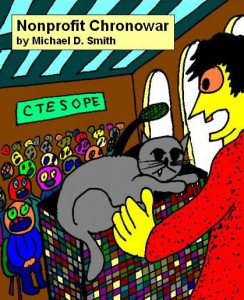
 Nonprofit Chronowar and its Real Cover
The first image above shows my cover for a late stage Nonprofit Chronowar EPUB I made to proof for errors. Although this crude image describes Joe Commer’s Chapter One confusion upon time traveling from 2036 to confront the nonprofit ladies of the 2020 Committee to End Suffering on Planet Earth, there’s no way it gets the feel of the novel as does the published cover by Double Dragon publisher Deron Douglas (right).
I made an EPUB of the first (2002) draft of Nonprofit Ladies, the original version of the final May 2013 Nonprofit Chronowar, just to reread it and celebrate the long history of this book following its publication.
The first and last chapters of the rough draft share similarities with the final version, but the middle meanders into unholy, confusing, and unpublishable directions. In fact I was struck by huge sections that I barely recall writing, passages that seem written by someone else.
It was an interesting exercise to create Nonprofit Ladies Draft 1 as one Word file; this involved pulling together its nine separate chapter files (I kept using separate chapter files until I finally realized in 2009 that a single file manuscript is the norm) and reformatting the entire thing as a newly-defined Normal style, which caused some loss of bold, italics, and centering. But since this project was only for my own rereading, I didn’t correct these problems or the numerous typos I encountered. A rough rendering of a rough draft.
I then cropped a March 2003 watercolor to make this cover. It conjures up a zany mood I’d like to remember the book’s first vision by.
Another image created for an error-catching EPUB reading file. It has little to do with the overall thrust of the novel. I made this picture of Martian Star General Greeney Gooney (real name G’rea’nyaigu’nye, which humans have naturally come to mispronounce) as the fourth novel of the Jack Commer series, Collapse and Delusion, was gestating. Greeney was cleverly mentioned in passing in the third novel, Nonprofit Chronowar, as running for mayor of Marsport, setting the stage for him to become a major figure in this fourth book, due to be published by Double Dragon Publishing.
I would definitely wince to see this cartoon become any sort of basis for the published cover!
This image was thrown together from one of my Trip to Mars images for the fifth Jack Commer novel I’m currently writing. I don’t have a real visual conception for this novel yet, so this image is again just a placeholder. I won’t create an EPUB copy of the ongoing drafts of this novel until I get to the manuscript stage and have something to proof. I don’t even have a handy little web page for it yet. This black and white image is bare bones and somehow reminds me of a textbook cover.
As an example of a cover I did produce for a finished publication (on Smashwords, Barnes and Nobles’ Nook Press, and amazon.com’s Kindle Direct Publishing), here is The First Twenty Steps cover. I put a lot of work into this one, though I know it’s not perfect. My main issue with covers seems to be finding a good lettering for title and author, distinctive letters that set themselves apart from the background. So far I’m dissatisfied with what I find in Word, Publisher, PowerPoint, Paint, etc. Another factor is making sure your image still conveys something (probably “Buy me!”) when shrunk to thumbnail size.
In any case, all these images are better than the generic “No image available” book covers you occasionally run across.
Copyright 2013 by Michael D. Smith


Pingback:Draft and Final Covers: Nonprofit Chronowar – Sortmind Blog
Pingback:Draft and Final Covers: Nonprofit Chronowar – Sortmind Blog – Michael D. Smith