Ranna Kikken Commer in 2076
I felt disconcertingly cold towards Balloon Ship Armageddon, both during its writing and in the week after finishing it, until I wrote the previous blog post on its origins, including a silly overblown synopsis. At once I felt a strong new connection to the novel, and a desire to fully feel what it means to end the Jack Commer series. The composition of the book has had its ups and downs, including the realization that I’ll probably have to eventually self-publish it. (Unsure of that yet–more later.) Though novel forces did channel themselves into the writing sessions, much as they’ve always done, I’ve also felt distant from the book during a time of several stressful interruptions from daily life. Unconscious energies seem to have pushed this story in certain directions I hadn’t planned, but in retrospect I welcome them all.
Selected observations written from February 19th through October 6th will now take over in a crude emotional timeline. The notes are usually several days to a week apart:
The vaporware of a Jack Commer 7, which I do want to write but don’t want to feel rushed on.
The 2/20 visionary dream of space wars and empires.
The concept of new writing can be unsettling, because you’re not inside the magic consciousness of the novel yet and so doubt it can be done. Well, it may just be time to start pulling together some notes and just get started. See what happens.
I sense I’m closer than I think to new writing. Not quite ready to jump into a Chapter One just yet, of course, but it may be closer than I suspect. I think JC Seven may be the first one of some new kind of writing.
Now I can feel a major shift: I’m looking to “new novel” not out of a desire to “prove I can do it,” but because I need it to grow.
Okay: the decision has been made (and I leave that in passive voice because somehow that’s how it happened) to start JC 7 as soon as practicable. Even today’s writing session is starting it. There are enough ideas to get it rolling, and even if it’s a failure, so what? But now I’m seeing that the seventh book should conclude the series. The series has no overarching plot, but there can still be a conclusion, and I can be done with the series and characters on my own terms, not just “I wrote six of them and never got around to doing more.”

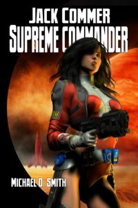
Jack’s wife Amav dominating the cover of Book Two, Jack Commer, Supreme Commander
So more Jack and Amav, and whatever characters I think need some amplification, but this time all expressed in a testbed of new writing and new energy. I want JC 7 to be fun storytelling; just see where it goes. There is also some research on neighboring stars to do, some framework to set in place. Rereading the first books in the series is also probably a good idea.
Some more thoughts and integration-yearning on a Jack Commer Seven this past week, along with the blog post on the Alpha Centaurian stars. JC 7 still needs some great focus, as right now it’s just sort of run-of-the-mill plot. Then again, many of my novel notes started this way. I remember thinking the original Collapse and Delusion notes weren’t that much of a story.
I’m having that “pre-novel malaise,” like the initial feeling of coming down with a cold. But somehow all this seeming negativity is pointing to something uncanny and new.
The main writing news is that I’m happily 12,000 words into interviewing twelve of the characters for Jack Commer Seven, having done six of the twelve since 4/1, and it feels like a mixture of notes and fiction, very therapeutic and with some good surprises. So about halfway done, expecting ca. 40-50 pages single-spaced.
Just finished the Jackie Vespertine interview, have two more to go to finish the twelve. It all feels great, and each character has given me fresh insights.
The major creation news is finishing the twelve interviews for Jack Commer Seven, which would fill 96 standard pages at 22,956 words. Each of the twelve characters has been a surprise, and I can feel their energy adding immensely to the book. I even edited the 48 single-spaced pages down to ca. 14 for nuggets of plot, and split these up in seven proposed “areas.” But I need to leave the notes alone for a while. There have been some great additions from the interviews, but so far only the first few scenes of JC 7 seem like writable fun; the rest are interesting ideas tacked onto what feels like dull plot. (Jack and Amav especially commented on this.)
I “seem” to be “almost ready” to “start” Jack Commer Seven. The most recent round of notes/ideas has at least removed major obstacles or dullness, and there is some sort of plot. I find myself blocking out the first couple chapters, a good sign. And weirdly, despite the pervasive busy-ness of life, which I know I’ve complained about since high school, it’s almost as if a certain number of unimportant actors have quietly left the stage, and the lights are coming up on bare boards and a seventeen-hour improvised monolog–which somehow, I don’t fear performing. The twelve Jack Commer character interviews were like writing a refreshing quick novella–they did not seem busy or stressful or obligatory–and they’ve given this project a lovely backbone, along with my listening to several recently-published science books over the past few weeks. So even if the first draft is a sprawling mess, there’s a heart to it already, and a psychic space around the project.
There’s a background of negatives that I need to be working on as well, but somehow everything feels to be moving in the right direction. The new writing is both separate from the concern about The Negative and yet tied to it somehow; there is some movement forward I’m surfing on with novel and daily life in tandem.
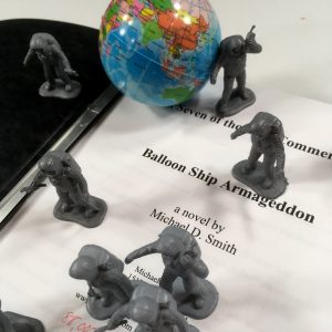
Started Balloon Ship Armageddon on 5/31.
During this time I’ve written 38 pages of Balloon Ship Armageddon, enough to start relaxing and to feel confident about the process.
Still stumbling forward in BSA but each chapter does open things up more. It’s funny, even after only 97 pages, to go back and reread say pages 13-20 and realize I’d completely forgotten writing them!

Suzette Borman, who continues to demand a greater role in the novel.
Balloon Ship Armageddon, at 113 pages, has had its moments, including the wondrous forgetting of entire chapters from a couple weeks ago. I’m not about to judge it as a novel right now. It’s certainly not the time for it. However, I’m not feeling much magic so far–not that I require that, and I definitely will finish this novel and see here it leads–but the writing seems rushed and somewhat tired, with not much in the way of sparks. Then again, expecting the writing to “have sparks” and “be entertaining” is getting away from the purpose of a novel. While new ideas and relationships are popping up unexpectedly–always a good sign–there’s a sense of tired and ambiguous plot to come. The characters seem somewhat flat as I try to work out the plot around them. That can be remedied in a second draft, but … characters are everything. Why are they not developing? Or are they and I’m just sort of blind to it now?
Where are the interesting energies that came up in the twelve interviews?
Basically I need to pull back–not for any extended length of time, but enough to throw out some entirely new ideas, even if they’re silly at first glance. Also to see what may be unworkable (i.e., boring to write) in the upcoming notes. I think one unconscious paradigm I’ve been laboring under is that I need to limit my characters to five or six, limit the plot to a simple journey to the Greater Magellanic Cloud, enshrine the 2/20/18 dream (the star map), and, perhaps most daunting of all, finish the series with some grandiose “statement.”
So the above has been an energy drain, and maybe has kept me from experimenting. I absolutely can’t decide whether the series is done until I finish BSA.
I don’t want to write BSA as some assignment to complete before embarking on entirely new writing. Any novel deserves your complete attention.

Jack Commer in 2076
I’ve followed the concept of “characters needing resolution” within a book for years. Sometimes you see that a character needs fuller development in a given book, but that should come from their personal high energy physics, not from a need to conclude something like a therapeutic relationship with one’s analyst. And their high energy may leave them stranded or open-ended or even magnificently unresolved. So be it. Why aim for fussy pottery and perfect tapestry?
At 140 pages on Balloon Ship Armageddon and not much to say about it now except that a) it’s been surprisingly much more difficult than other novels, b) but the rough draft results aren’t bad at all, c) I spent a few days reorganizing ideas for the rest of the book and it does seem writable now, and d) I’m starting to warm up with good psychological associations. So we’ll just see where this thing leads.
At 43,317 words now, 16 chapters and 163 pages. I’m feeling good about this novel, even though its “unsteady energy” aspects have been with me from the beginning. Some themes and investigations are developing which I’d hardly been able to conceive of at the beginning.
Good writing on BSA and now I can relax about finishing it; it will happen at its own pace. At ca. 54,000 words and 202 pages. Have no idea how far I really am through it now–halfway, one-third, etc.

Waterfall Sequence, entity from the star Iota Persei
I think I’m maybe 60-80 pages from finishing. It’s going well; even the fact that I’ve completely forgotten earlier parts of it, and must sometimes reread previous chapters to make sure the current chapter is grounded, seems to indicate fresh raw creation that can be amplified later. But there have been some problematic aspects of BSA, most of all a sense of the writing being rushed or done out of obligation, and of not quite feeling involved with it. And yet … each writing session seems to bring out some buried or channeled stuff I hadn’t imagined in any of my notes. So there is some stretching going on. Whether or not this will be the final Jack Commer remains open, but I sense that the difficulty I’ve had so far is a mood of completion. And the plot itself seems to indicate we can’t get any further.
I’m trying to marshal energies for the last part of BSA. How it ends is still vague, but I can’t do much more than assess my notes and see what happens in actual fiction. Somehow I’ve gotten 294 pages done over the past four months, and I know there’s some great stuff in there. Naturally this thing will need a thorough revision, but it’s hard to speak about that with the first draft not yet done. There are characters and themes all over the place; some may succeed and others not. I don’t want to write a fast sloppy ending to this, but I can’t hold out for a perfect resolution of everything, either. Trust in the channels and this will be finished as appropriately as I can do it.
Possibly fifteen to twenty pages from the end of BSA. It does seem too conceptual now, so I don’t have to be attached to the current eight pages of notes. Need a few days off to contemplate how this could go. But even if there are no breakthroughs, I’ll just finish it in any case, see what a second draft implies.
Balloon Ship Armageddon Draft 1 was more or less a rough ride. Completed it in a most-of-the-day session, 10/6. 333 pages, 88,007 words. I believe the title will stay the same, as opposed to all Jack Commer novels except The Martian Marauders. I’ll sit on this awhile; I need some relaxing, some observing, some meditating.
Copyright 2018 by Michael D. Smith

